Overview
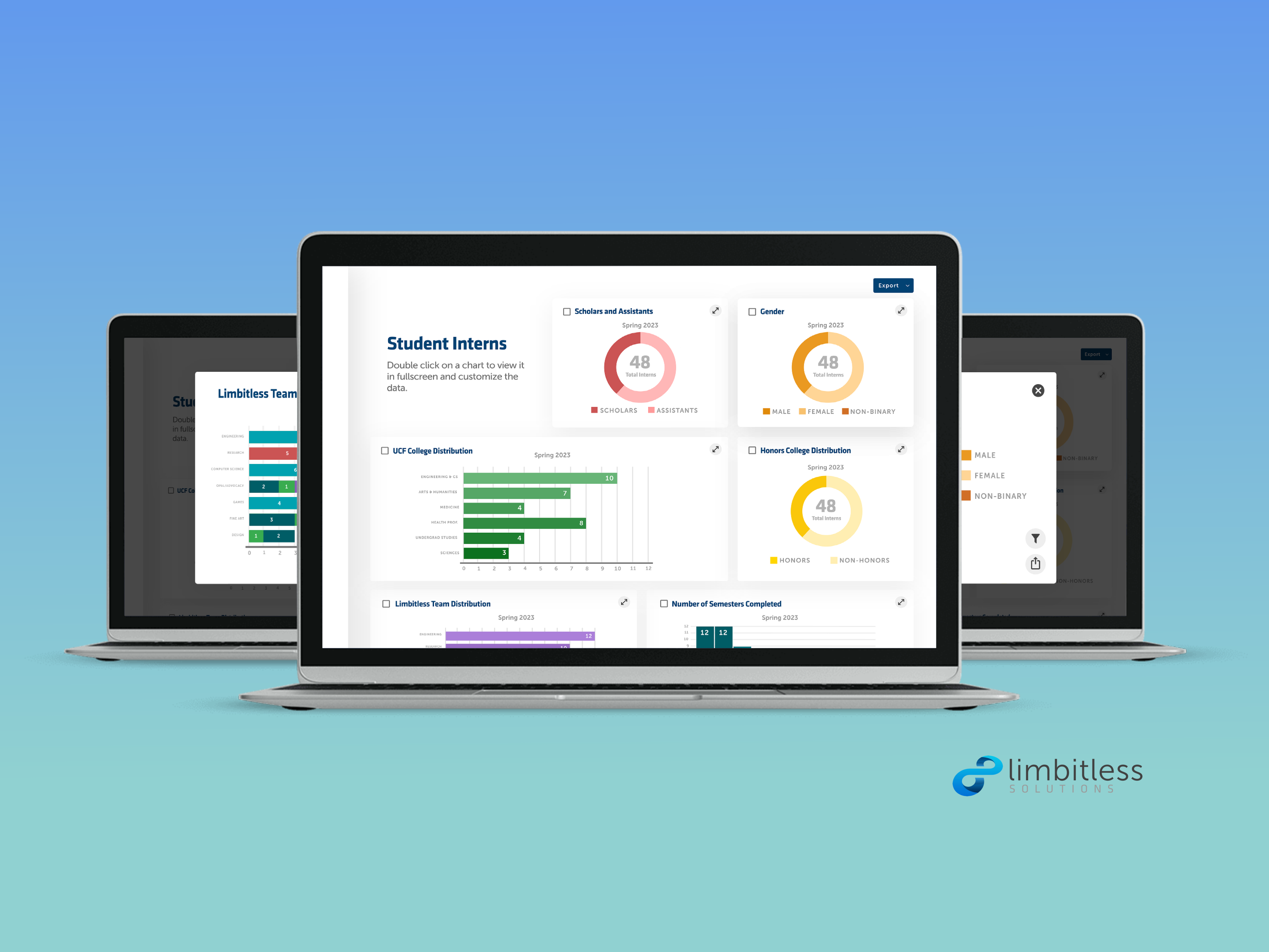
The Limbitless Solutions team website serves as a multifunctional hub for internal operations including work hour tracking, self-evaluations, calendar access, and task management. Yet, feedback from users highlighted notable usability challenges that demanded improvement.
Role
UX/UI Designer
Toolkit
Adobe XD, Miro
Timeline
4 month internship, Jan 2023 - April 2023
Team
Solo project with weekly input from Branding Director and Executive Director
Research
Site Audit
As a recent addition to the Limbitless team, I approached the existing team website with a fresh perspective. Through a comprehensive UX audit, I discerned several fundamental usability issues and identified key pain points, including:
• Poor information architecture with a lack of information hierarchy
• Poor categorization
• No visual prioritization of most important content like meeting dates and times
• Less frequently used content like "emblems" section is dedicated too much space
• Dated and boring design
• Inconsistent link styling (color and letter case)
• No status section on reports to see if they are already submitted
• Calendar widget is mostly useless without dates
• Confusing progress section
• Progress radials are difficult to understand compared to linear progress bars
• Lack of time indicators on "day" progress radial renders it useless for tracking time
• No legend for different color meanings
Annotating the previous design
Understanding Users
I started my user research by conducting in-person interviews with 10 users. Synthesizing the feedback from the users, I identified the following pain points:
Pain Points
Ideation
Using the feedback and pain points from the user interviews and UX audit, I started brainstorming potential solutions. I created an affinity map to categorize the insights and gain a better understanding of how to satisfy user needs.
Affinity Mapping
Affinity Mapping - Pink for problems and green for possible solutions
Design
Low-fidelity Wireframes
Sketching played a pivotal role in refining content layouts for optimal page space utilization. Notably, for the profile section housing time logs, I discovered that a horizontal layout outperformed a vertical one. This process not only facilitated ideation for the dashboard layout but also provided key insights that informed subsequent high-fidelity designs.
Low-fidelity wireframes
Mid-fidelity Wireframes
During mid-fidelity wireframing, I focused on refining the dashboard's structure and functionality. This phase allowed me to optimize the arrangement of the content, ensuring a coherent and intuitive presentation of the information.
Mid-fidelity wireframe of the dashboard
Visual Design
While creating the style guides for the site I had to keep the company's brand and visual guidelines in mind. I stayed true to the original typography of the site that symbolically represents Limbitless' mission of using technological innovation to empower, inspire, and spread compassion.
For the colors, I chose similar hues to those used on the company's public site. The blues represent Limbitless' technology and spirit of innovation, while the other bright colors represent creative expression, empowerment, and the company's bright, family-friendly atmosphere.
Style guides for light and dark mode
User Testing and Iterations
Conducting user testing with a cohort of 10 participants, I leveraged their insights to identify problems and drive iterative enhancements.
Problem 1: No Distinction Between Notifications
User Feedback: Users found it challenging to differentiate warning notifications (e.g., late clock-ins) from positive notifications (e.g., successful submissions).
How might we effectively differentiate between warning and positive notifications to ensure users promptly grasp their significance?
Solution 1: Added color-coded icons to delineate informational, positive, and negative notifications.
Problem 2: Legibility of Weekly Meeting Cards
User Feedback: Users reported difficulty in reading the times on the meeting cards.
How might we optimize the readability of weekly meeting cards, ensuring users can effortlessly discern meeting times and details?
Solution 2: Prioritized and enlarged the text of meeting times. Removed end times (considered less important) and replaced them with duration times in a smaller font.
Problem 3: Color Inconsistency and Incohesive Design
User Feedback: One user expressed that the site looked sporadic and incohesive.
How might we create a more cohesive and visually consistent site design to provide users with a seamless and intuitively navigable experience?
Solution 3: Utilized color to unify related content. Changing all tasking-related content to purple and time-related content to green helped with the visual organization and unity of the site.
High-fidelity Interactive Prototype
Reflection
This website redesign marked my shift from personal projects to professional work with a company. It provided me with practical insights into designing with a company's goals in mind. Additionally, it was a learning experience in effective collaboration, requiring adept communication and coordination with various teams, including graphic design, development, and the administration team.
Key Takeaways
Embracing Novel Solutions: One of the most valuable lessons I learned was that familiarity shouldn't outweigh effectiveness. It became evident that simply because a design was present in the old product didn't necessarily mean it was the best solution. I had to challenge myself to explore new design ideas that better aligned with users' needs, instead of clinging to outdated designs.
Navigating Feedback Divergence: Working on a team site with diverse users meant receiving a range of opinions. I learned the importance of designing for the majority while keeping user needs in focus, understanding that it's impossible to please everyone.
User-Centricity through Research: This project redefined my perspective on user-centered design. While the traditional advice has always been to 'put yourself in the user's shoes,' I discovered the limitations of such an approach. Design, I realized, should be rooted in a deep understanding of users, and this understanding doesn't stem from personal assumptions. It was through user interviews that I gained genuine insights into what the users truly needed, dispelling my earlier misconceptions.
Overall, this project was an incredible learning experience that broadened my horizons as a designer. It taught me to challenge the status quo, navigate the intricacies of feedback, and, most importantly, underscored the irreplaceable value of genuine user research in crafting impactful designs.


