Overview
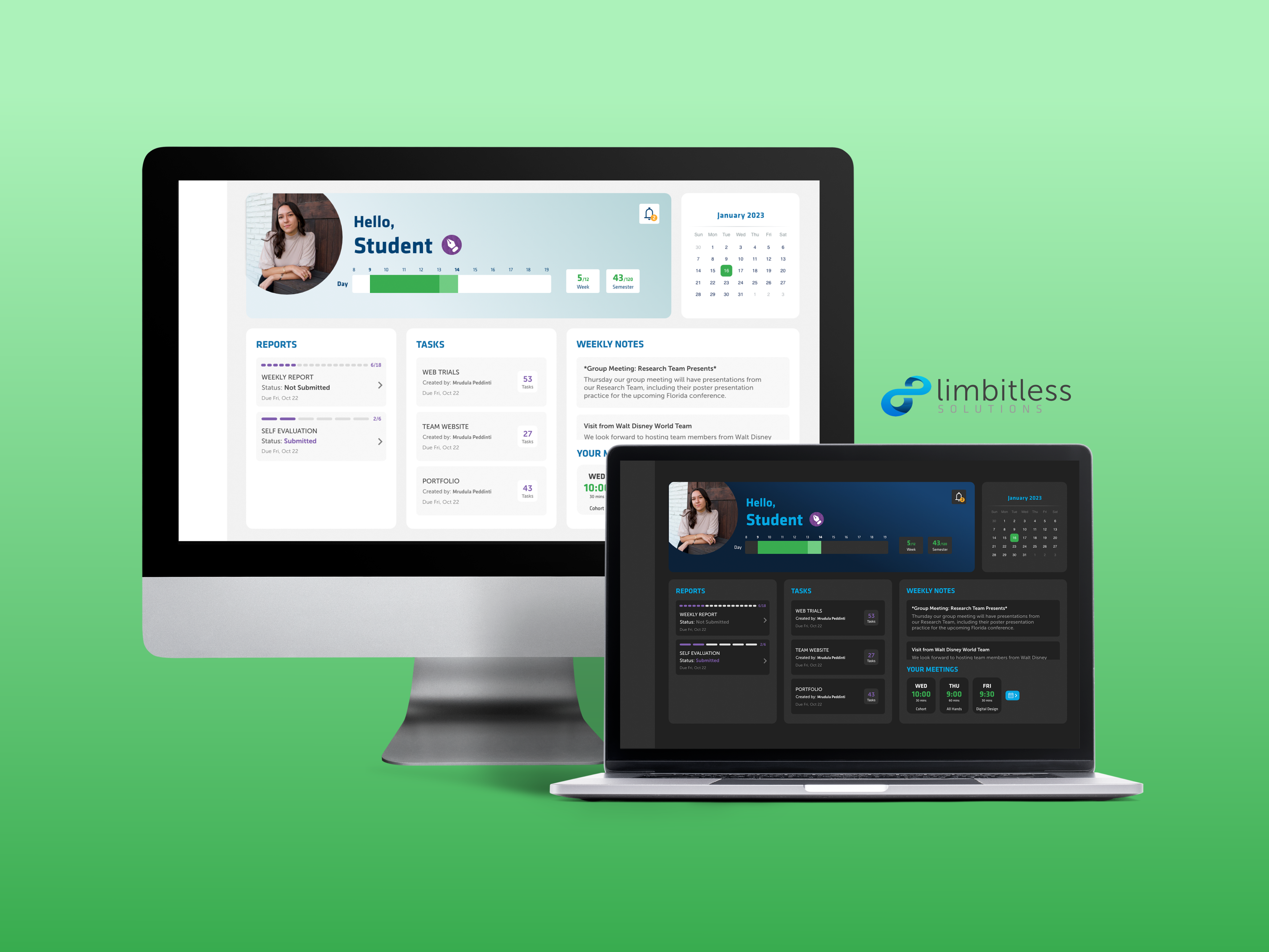
During my internship at Limbitless Solutions, I undertook a critical project focused on optimizing the communication of student intern data via an intranet dashboard. Effectively presenting this data is pivotal for Limbitless on various fronts. It serves as a cornerstone for informing UCF executives about the organization's performance, aiding donors in identifying potential areas for support, and offering aspiring interns a glimpse into their potential role within the team. Building upon the foundation set by the previous UX/UI intern, I took her prototype for displaying student data and expanded upon it to create a robust and user-friendly dashboard.
Role
UX Researcher, UX Designer, UI Designer
Toolkit
Adobe XD, Illustrator, and XMind
Timeline
4 month internship, Jan 2023 - Apr 2023
Team
Solo project with weekly input from Branding Director, Executive Director, and Developer
Strategy
Identifying the Problem
I initiated the project with user interviews aimed at understanding the needs of the intended users (the administrative team), and their experiences with the previous intern's design. Through this process, I identified several key issues:
• Lack of a unified platform for viewing or exporting student intern data
• Handmade charts created with Illustrator, lead to challenges in updates (incompatible with Chart.js)
• Incorrect chart types used for certain datasets
• Absence of a dashboard layout, impeding a comprehensive view
• Limited functionality for filtering, overlapping, or customizing data
Pain Points
Heuristic Evaluation
I conducted a heuristic evaluation of the previous intern's prototype to discern which designs were effective and which needed improvement. This assessment served as a valuable guide in the redesign process.
Annotating the previous intern's design
Defining the Product
I turned to XMind for a clear visual representation of my ideas. By mapping out connections between different concepts, I gained a better understanding of user needs and how to enhance the overall user experience.
Visualizing Conceptual Relationships for Product Definition
Setting Project Goals
After identifying the problem and defining the product, I established goals for the project. These objectives acted as a guiding compass throughout the design process, assisting in delineating the project's scope, prioritizing critical elements, and providing a clear sense of direction.
1. Transform the scroll design into a widget-based dashboard for comprehensive data visualization
2. Optimize chart types for each dataset
3. Ensure compatibility with Chart.js for dynamic data updates
4. Determine crucial datasets/charts for overlap
5. Implement efficient data filtering and exporting methods
2. Optimize chart types for each dataset
3. Ensure compatibility with Chart.js for dynamic data updates
4. Determine crucial datasets/charts for overlap
5. Implement efficient data filtering and exporting methods
Research
Marketplace Analysis
I started the research phase by conducting an analysis of dashboard designs that I found on Behance and Dribbble. I found a prevalent trend where aesthetics often took precedence over design effectiveness. Many designers use the wrong chart type for the data they are trying to communicate, sometimes opting for complex charts purely for aesthetic purposes.
Below is an example of a dashboard that prioritizes visual aesthetics but is not necessarily the most effective for communicating data.
Dashboard by Elena Kotova on Behance
Choosing the Best Chart Type for Each Dataset
Data is only valuable when you know how to visualize and give it context. Choosing the correct chart type for the data ensures that the message of the data is clear and accurate.
For instance, using a bar chart to show student distribution amongst the many UCF colleges effectively communicates the diverse and interdisciplinary nature of the Limbitless team.
Keeping in mind the limitations of Chart.js, I used the diagram below to decide which charts best fit the data and message I was trying to communicate.
Chart selection diagram created by Dr. Andrew Abela
I documented my research and noted the best chart type for each dataset. Below is a sample of my research documentation that I used to inform my design decisions.
Sample Research Documentation: Guiding Design Choices with Optimal Chart Types
Design
Low-fidelity Wireframes
After deciding the best charts for each dataset I sketched out some potential layouts. Creating low-fidelity wireframes provides me with a quick and easy way to visualize and test ideas without getting bogged down in the details.
Low-fidelity wireframes
Mid-fidelity Wireframes
During mid-fidelity wireframing, I was able to focus on the structure and functionality of the design without getting distracted by aesthetics. This allowed me to strategically order charts, starting with broader insights like intern types and gender distribution before delving into specifics like team distribution. This approach ensured a clear and effective flow of information, maximizing the dashboard's impact for swift and comprehensive user understanding.
Mid-fidelity wireframes
User Testing and Iterations
Problem 1
User Feedback: Users expressed interest in a more streamlined view, particularly when focusing on specific data points. Additionally, some preferred absolute values over percentages for precise analysis.
How might we provide users with the ability to customize their chart displays for a more tailored data viewing experience?
Solution: To meet this demand, features were integrated to allow users to toggle off the data axis and gridlines, providing a cleaner view. Additionally, functionality was added to switch between percentage and integer value representations, granting users greater control over their data analysis.
Adding data display filtering options
Problem 2
User Feedback: Some participants found it challenging to discern specific data points when multiple categories shared similar hues. The issue arose when users overlapped data between Team Distribution and College Distribution, where the color green represented both the Fine Art team and the College of Sciences, leading to confusion.
How might we improve data clarity and differentiation for users when overlapping categories?
Solution: To address this, a shift was made from a diverse color scheme to an analogous palette. Each chart now employs a harmonized color scheme, ensuring that distinctions are clear and avoiding any inadvertent color associations.
Switching to an analogous color palette
Visual Design
To ensure a cohesive and organized design, I established style guides specifying design standards for the dashboard. Each chart received a thoughtfully selected color from an analogous palette, creating visual harmony. It was crucial, however, to maintain sufficient contrast for optimal readability. This meticulous color curation not only organized the data effectively but also prevented any potential color associations that could lead to user confusion.
UI style guides
I ensured WCAG AA-compliant color contrast using a ratio checker. This guaranteed charts were accessible to all users, regardless of visual impairments.
Contrast checking
Final Designs
I applied the styles to my wireframes and added more details to create a high-fidelity prototype. Through continuous user testing and iterative design, I refined the prototypes until they accurately addressed the user's needs and were ready for handoff to the development team.
Interact with the full prototype here.
Final designs
Key Features
1. Chart Exporting
Empowering users to save time and enhance productivity, the redesigned dashboard incorporates a robust chart exporting feature. Now, users have the ability to select multiple charts and export them simultaneously, streamlining their workflow. Moreover, they can export the charts in various file formats at once, providing ultimate flexibility for their specific needs.
2. Advanced Filtering and Overlapping
To facilitate in-depth data analysis, the new dashboard introduces advanced filtering options. Users can seamlessly compare data across multiple semesters and overlay datasets for comprehensive insights. Additionally, this feature extends to the exporting function, ensuring that charts reflect the precise filtered data for seamless sharing and documentation.
Reflection
During this project, I learned a lot about the importance of visual communication and data visualization in UX design. I found that when it comes to presenting complex data sets, the way that data is presented is just as important as the data itself. Through my work on this project, I discovered that clear and concise visual communication can help simplify complex information and make it more accessible to users.
Overall, my experience designing a data dashboard taught me the importance of thoughtful and intentional visual communication as well as the need to design for both form and function. By selecting the right type of chart or graph and carefully choosing colors and typography, I was able to create a dashboard that not only presented information clearly but also provided users with valuable insights.
Special thanks to Mrudula Peddinti, my supervisor, for her dedicated mentorship and support throughout this project.


